Image analysis in ML pipelines for biology: a maths-and-plots guide
Biological image analysis is where measurement meets models. A microscope image is not “just pixels”: it’s a noisy sampling of an underlying biological scene (cells, nuclei, organelles), transformed by optics, staining, sensor noise, and experimental variability.
This post is a practical, end-to-end guide to building machine learning (ML) image analysis pipelines for biological data. The rule throughout is:
- If we make a conceptual claim, we’ll back it up with an equation or a plot.
All figures in this post are generated from synthetic “microscopy-like” images so you can follow the ideas without needing a private dataset.
1. What is an image (mathematically)?
For most ML pipelines, an image is a function on a discrete grid:
\[I:\{1,\dots,H\}\times \{1,\dots,W\}\to \mathbb{R}^C,\]where $H$ and $W$ are height/width and $C$ is the number of channels (e.g. $C=1$ for grayscale, $C=3$ for RGB, or $C>3$ for multiplexed fluorescence).
At the physics level (useful intuition for microscopy), you can think of an observed image as:
\[I = (S * h) + \epsilon,\]where $S$ is the true scene, $h$ is the point-spread function (PSF), $*$ is convolution, and $\epsilon$ is noise (shot noise + read noise + background).
Figure: synthetic “cells” with blur + noise (a toy microscopy model), alongside the ground-truth object masks.

2. The pipeline: from pixels to biology
Most biological image ML workflows are variations on:
- Acquire: imaging settings, channels, controls, metadata
- Preprocess: denoise, normalize, correct illumination, register channels
- Label (if supervised): segmentation masks, classes, bounding boxes, weak labels
- Model: classical features or deep nets
- Evaluate: metrics that match the biology and failure modes
- Deploy: QC, drift monitoring, uncertainty, batch effects, reproducibility
We’ll go stage-by-stage with maths and visuals.
3. Preprocessing as “making a measurement”
Preprocessing isn’t cosmetic. It changes what your model can learn.
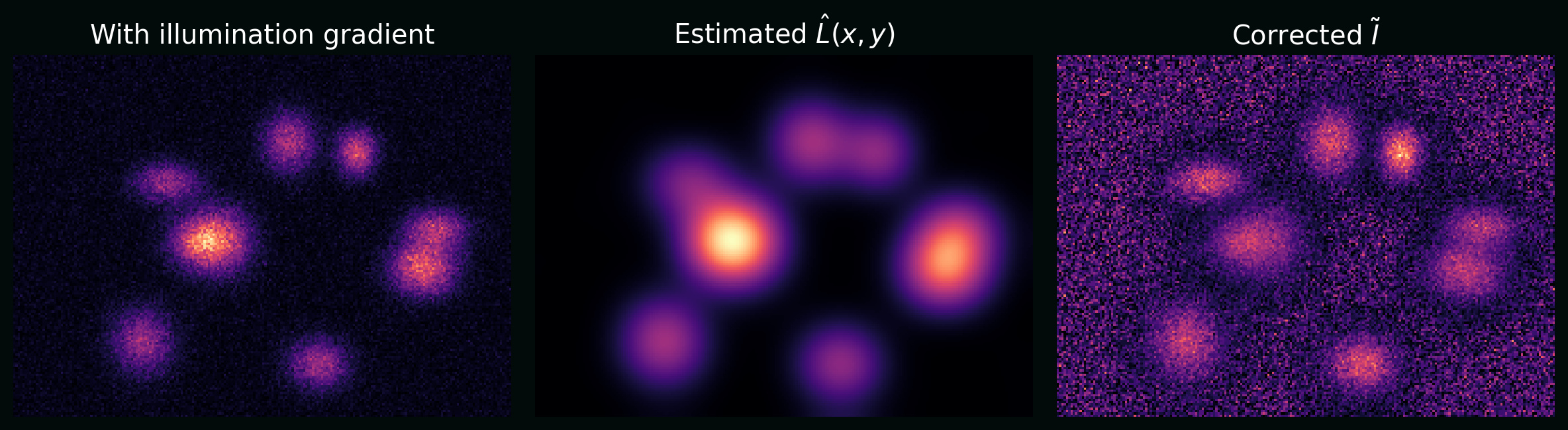
3.1 Illumination correction (flat-field)
A common microscopy artifact is spatially varying illumination. A simple multiplicative model is:
\[I(x,y) = L(x,y)\,S(x,y) + B(x,y) + \epsilon(x,y),\]where $L$ is illumination, $B$ is background, and $S$ is signal. A basic correction is:
\[\tilde{I}(x,y) = \frac{I(x,y) - \hat{B}(x,y)}{\hat{L}(x,y)}.\]Plot: a synthetic image with a left-to-right illumination gradient, and the same image after correction.
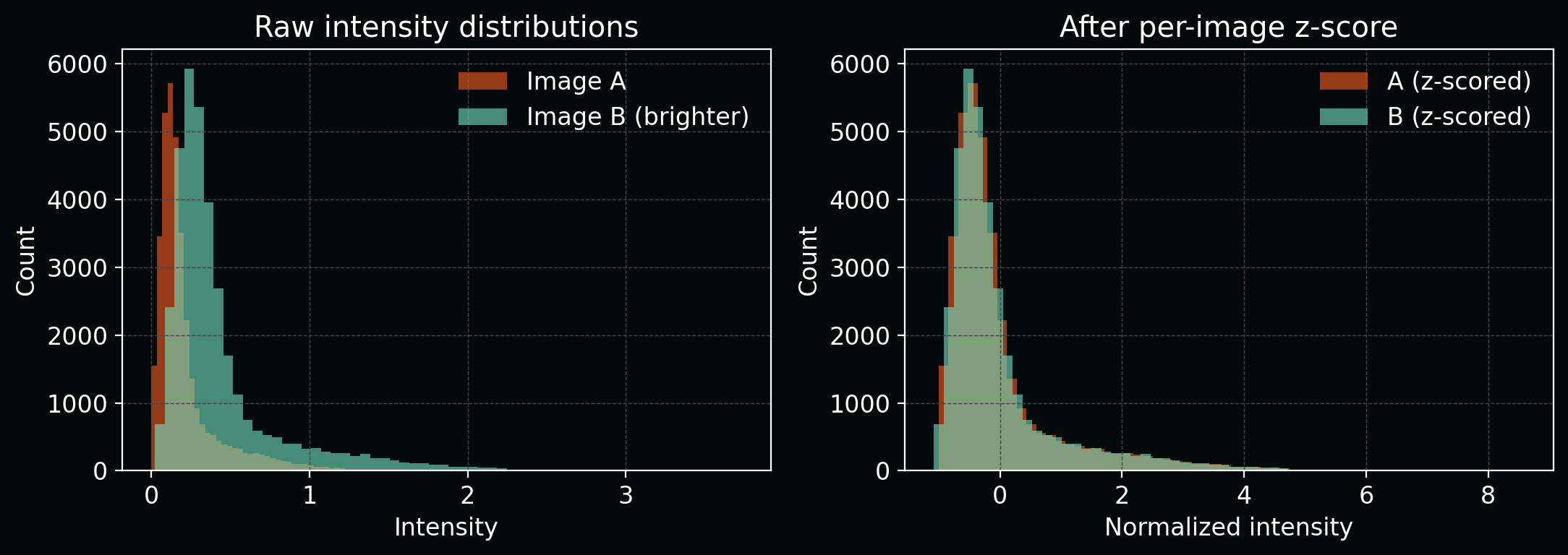
3.2 Normalization (why “scale” matters)
Many models are sensitive to intensity scale. A standard choice is per-image z-scoring:
\[I' = \frac{I - \mu}{\sigma},\]where $\mu$ and $\sigma$ are the image mean and standard deviation (sometimes per-channel).
Plot: intensity histograms before/after normalization.
4. Features: classical image analysis (still useful)
Before deep learning, bioimage analysis often meant:
- segment objects,
- compute morphology / texture features,
- run a classifier or clustering step.
This is still valuable when datasets are small, interpretability is crucial, or you want strong baselines.
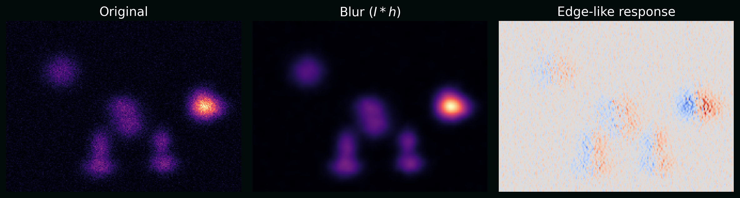
4.1 Convolution and filtering
A 2D convolution (single-channel) is:
\[(I * K)(x,y) = \sum_{i=-a}^{a}\sum_{j=-b}^{b} I(x-i,y-j)\,K(i,j),\]where $K$ is a kernel (e.g. blur, edge detector).
Plot: the same synthetic image after blur and after an edge-like filter, showing how kernels turn “biology” into measurable patterns.
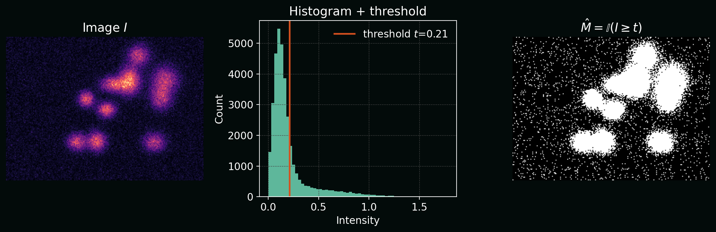
4.2 Thresholding (a segmentation baseline)
The simplest segmentation is a threshold:
\[\hat{M}(x,y) = \mathbb{I}\big(I(x,y) \ge t\big),\]where $t$ is a threshold and $\mathbb{I}$ is the indicator function.
Plot: intensity histogram with a threshold $t$, and resulting binary mask.
5. Supervised learning setup (datasets + labels)
Let ${(X_i, Y_i)}_{i=1}^n$ be a dataset of images $X_i$ and labels $Y_i$.
In bioimage pipelines, common label types are:
- Classification: $Y_i \in {1,\dots,K}$ (e.g. phenotype class)
- Detection: $Y_i$ is a set of boxes/points (e.g. foci counting)
- Segmentation: $Y_i\in{0,1}^{H\times W}$ (binary mask) or multi-class masks
- Regression: $Y_i\in\mathbb{R}$ (e.g. viability score)
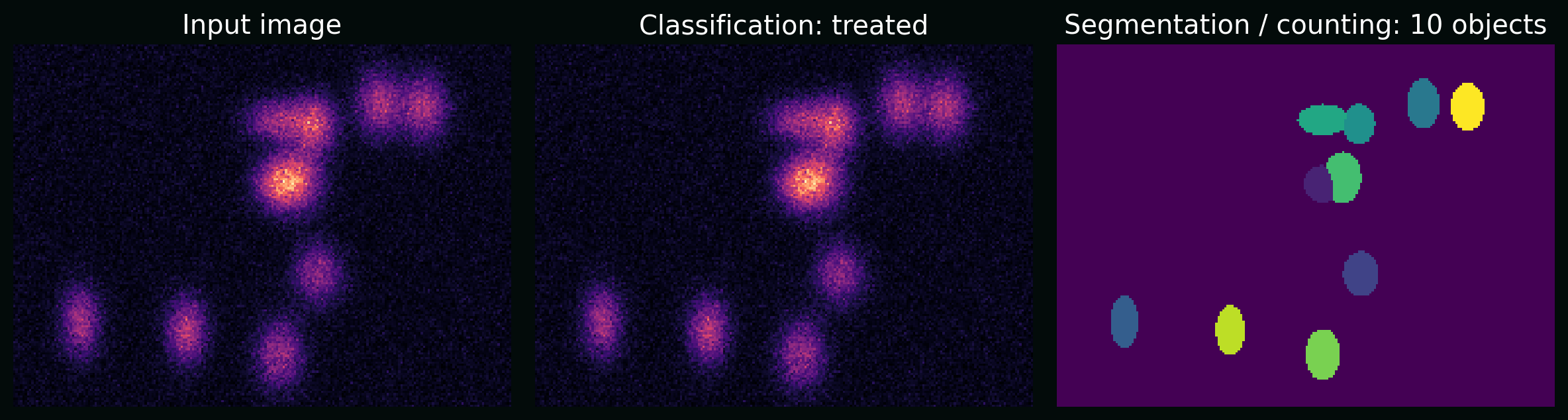
Plot: the same raw image supports multiple tasks (classification, counting, segmentation). The “task” is part of the pipeline design.
6. Deep learning for images (the core maths)
6.1 The convolutional layer
For an input with channels $C_\text{in}$ and output channels $C_\text{out}$, a convolutional layer is:
\[z_{k}(x,y) = b_k + \sum_{c=1}^{C_\text{in}} (X_c * W_{k,c})(x,y),\]followed by a nonlinearity, e.g. ReLU:
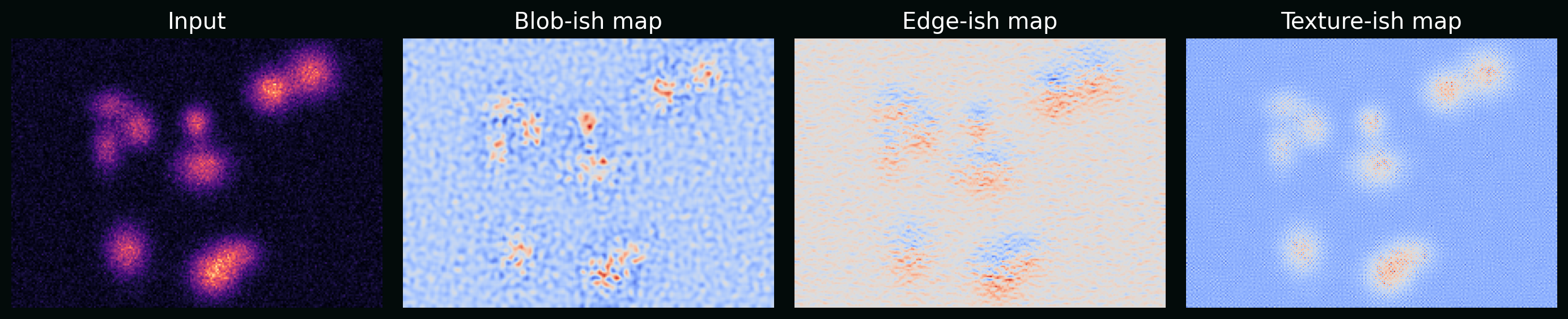
\[\mathrm{ReLU}(u)=\max(0,u).\]Plot: example feature maps from simple learned-like kernels (on synthetic images) to show “edges/blobs/textures” emerge.
6.2 Loss functions that match the task
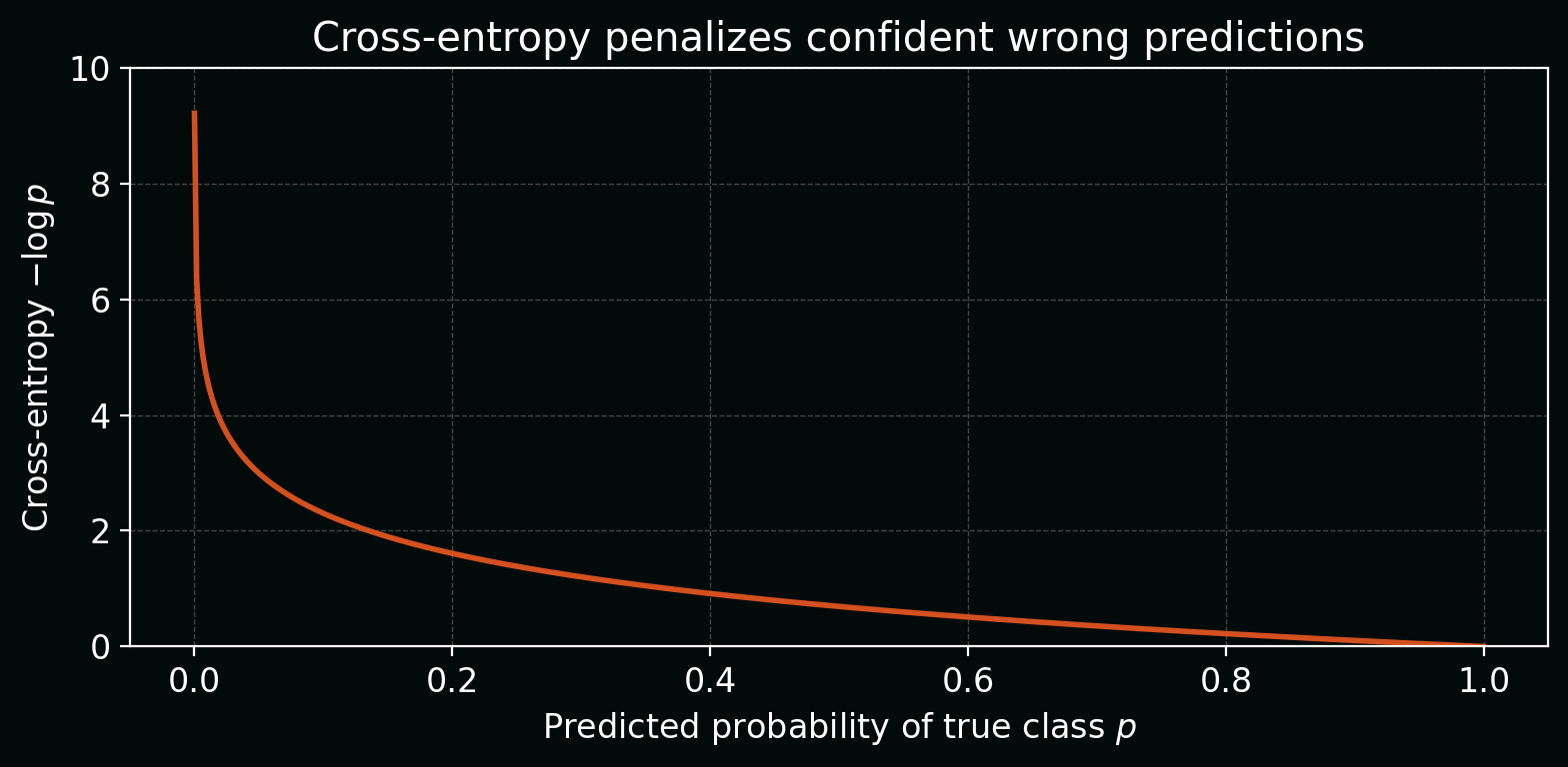
Classification (cross-entropy) with logits $s\in\mathbb{R}^K$ and true class $y$:
\[\mathcal{L}_\text{CE}(s,y) = -\log\left(\frac{e^{s_y}}{\sum_{k=1}^{K} e^{s_k}}\right).\]Plot: how cross-entropy changes as the model becomes more/less confident in the true class.
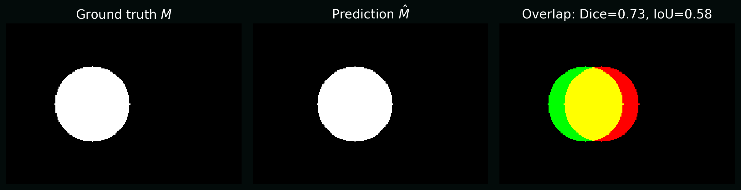
Segmentation often uses overlap-based losses because pixel imbalance is severe. Two common metrics/losses:
- Intersection-over-Union (IoU, a.k.a. Jaccard): \(\mathrm{IoU} = \frac{|M \cap \hat{M}|}{|M \cup \hat{M}|}.\)
- Dice coefficient: \(\mathrm{Dice} = \frac{2|M \cap \hat{M}|}{|M| + |\hat{M}|}.\)
Plot: the same predicted mask compared to truth, annotated with Dice and IoU.
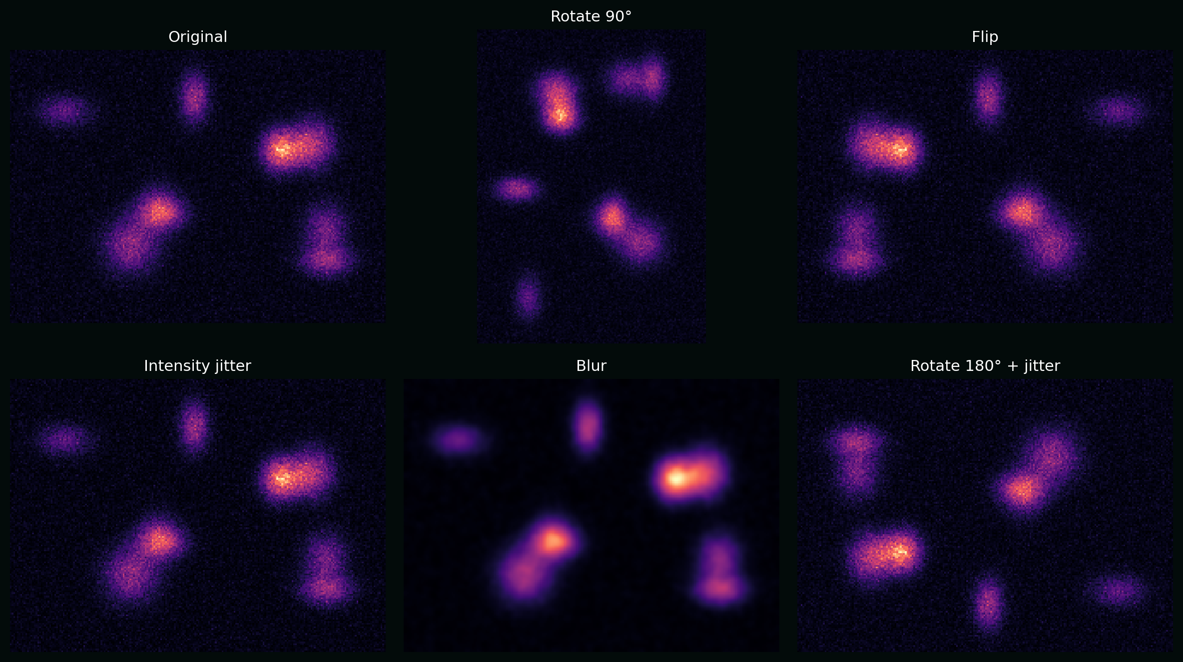
7. Data augmentation (maths as invariances)
Augmentation bakes in the idea that certain transformations should not change the label. Write an augmentation as a transformation $T$ sampled from a distribution $\mathcal{T}$. Training minimizes expected loss:
\[\min_\theta \;\mathbb{E}_{(X,Y)}\;\mathbb{E}_{T\sim \mathcal{T}}\big[\mathcal{L}(f_\theta(T(X)), Y)\big].\]Plot: a synthetic cell image with rotations, flips, intensity jitter, and blur—augmentations that often make sense in microscopy.
8. Evaluation: metrics that reflect biology
8.1 Classification: ROC and PR curves
For a binary classifier that outputs a score $s(x)$, a threshold $\tau$ induces predictions. Varying $\tau$ traces:
- ROC: TPR vs FPR
- PR: Precision vs Recall (often more meaningful for rare events)
Plot: ROC and PR on a synthetic imbalanced dataset.

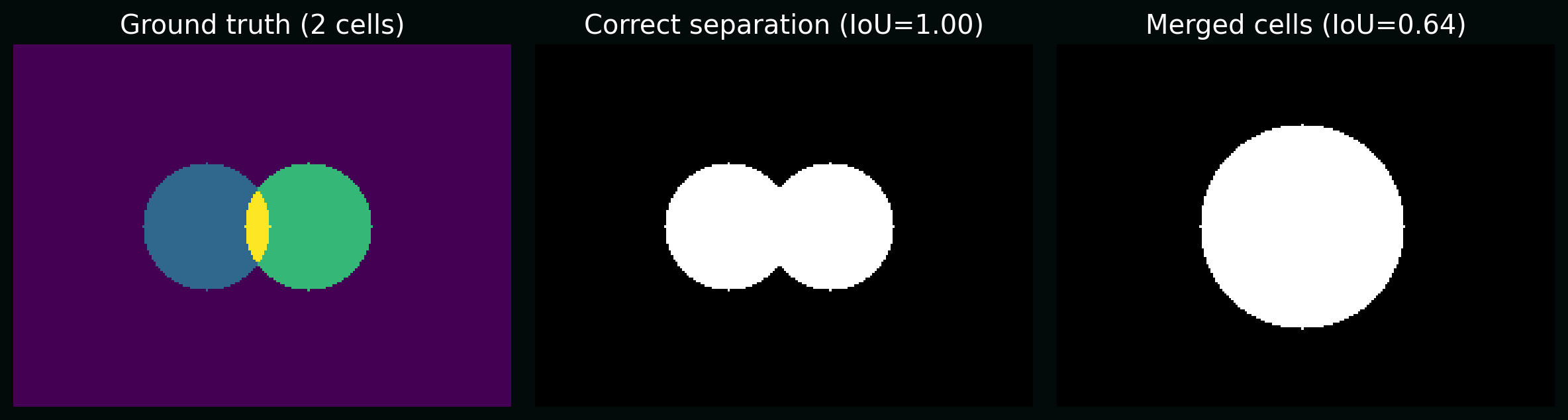
8.2 Segmentation: object-level vs pixel-level
Pixel metrics (Dice/IoU) can look great while biology is wrong (e.g. merged cells). For object-level counts, you often care about:
- splits (one cell → many masks)
- merges (many cells → one mask)
Plot: two predictions with similar pixel IoU but different biological correctness (merge vs correct separation).
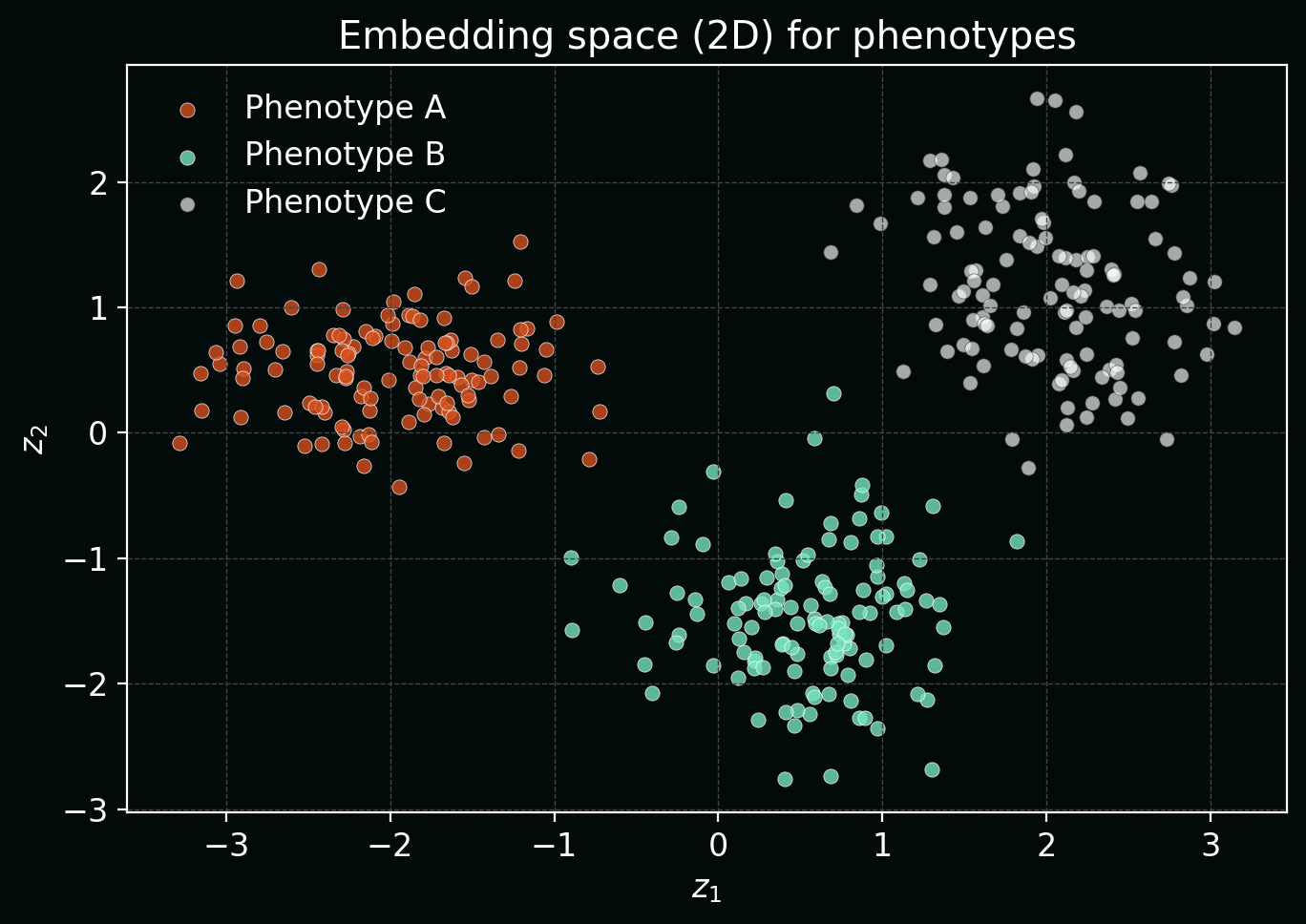
9. Representation learning for phenotyping (embeddings)
Often the goal isn’t a single label—it’s a phenotypic map of cells. A model can embed an image/crop into a vector $z \in \mathbb{R}^d$. Similar phenotypes should be close in embedding space.
Plot: synthetic “cell phenotypes” mapped into 2D embeddings (PCA-like) showing clustering structure.
10. Uncertainty and QC (because labs drift)
If a classifier outputs probabilities $p_\theta(y\mid x)$, a simple uncertainty proxy is entropy:
\[H(p) = -\sum_{k=1}^{K} p_k \log p_k.\]High entropy often flags out-of-distribution images, focus issues, staining failures, or new phenotypes.
Plot: examples of confident vs uncertain predictions, plus a histogram of predictive entropy.

11. A minimal “starter pipeline” checklist
To build a real biological image analysis pipeline, make sure you can answer (with evidence):
- What is the task (classification vs segmentation vs counting), and is it aligned with the biology?
- What are the nuisance variables (batch, plate, microscope, operator, stain intensity)?
- What is your ground truth—and what are its failure modes (label noise, ambiguity)?
- What are the metrics that reflect your scientific goal?
- What is your plan for QC and drift after deployment?
If you want, I can extend this post with a concrete worked example (e.g. nuclei segmentation + per-cell feature extraction + phenotype embedding), or adapt it to your exact modality (confocal, brightfield, H&E, multiplex IF).